

, with community art (the 30%) unique to the location.")
Companies create design standards for many reasons, including brand recognition and to simplify the procurement process. These standards provide explicit direction for the way the company uses art, lighting, space layouts, furniture, fabrics, security, technology and many other components of the design process.
Design standards can serve another purpose — to help the design team understand how much of the project must “stay within the lines” and how much is subject to creative interpretation. Because this ratio is often about 70%-30%, we use the term “Find Your 30” at Taylor Design.
This is an approximation, of course. We settled on “Find Your 30,” but every organization carries different standards, priorities and brand-driven requirements into a design project. For some companies, the ratio is 90%-10%; for others it may be closer to 50%-50%. When we designed our new Sacramento, Los Angeles and Orange County offices, we ensured that our breakdown was 70%-30%.
What does “Find Your 30” mean?
It is as important to identify your ideal ratio as it is to decide to create design standards in the first place. This informs the designer exactly how much freedom they have to use their skill and creativity to celebrate a unique culture from location to location.
Finding Your 30 gives each office a sense of autonomy, and it allows for bigger and broader concepts that emphasize distinctive cultural, historic or other similar attributes. While the “70” holds true to the company’s requirements for branding, company colors, furniture and materials, the “30” affords the designer – in collaboration with the owner and their team – the opportunity to deviate from the standards and introduce artwork, fittings, color accents and other elements that communicate a sense of community and ownership. This freer expression is often used to highlight cultural and historic aspects of the physical location, but can also reference other qualities, such as the firm’s mission, history, signature work or founding partners.
Why is this important?
When a design team goes into a project fully aware of what is flexible and what is not, it saves time, which saves money. Also, when you fail to define the ratio – to Find Your 30 – you lose an opportunity to simultaneously illustrate brand consistency with a uniqueness of place. This is particularly true in a renovation setting, where the goal is to seamlessly marry existing finishes with newly created standards in a complementary way. This lack of direction can lead to decisions being made on the fly, often badly. It invites confusion, crushes momentum and can cast a pall over the entire project.
The challenge and opportunity
Taylor Design approached its latest office space updates with a firm commitment to allowing each office 30% choice to promote the uniqueness of their space. Like many multiple-office firms, we encountered both lease extensions and entirely new locations, which added to the challenge. As we set about creating spaces that represent the singular Taylor Design Brand, while giving each location room to design a thoughtful story, we asked ourselves a number of questions:
What do we want clients and employees to feel and think about when they are in the space? As both designers ourselves and occupants of the space, we know that the answer lies in telling a lasting narrative about who Taylor Design is, what we stand for, and how the occupants of this particular office are firmly in the Taylor Design fold, yet also representative of the characteristics of the locality. The “30” helps to define the entire experience.
What standards should we employ? Standards in this context offer two parallel benefits: they help accentuate the brand (e.g., values, mission) and illustrate the culture (e.g., what makes us different). The goal is to craft a meaningful story within our spaces that keeps our mission front and center — “Design that Empowers People” — while sharing who we are as a distinctive community of designers.
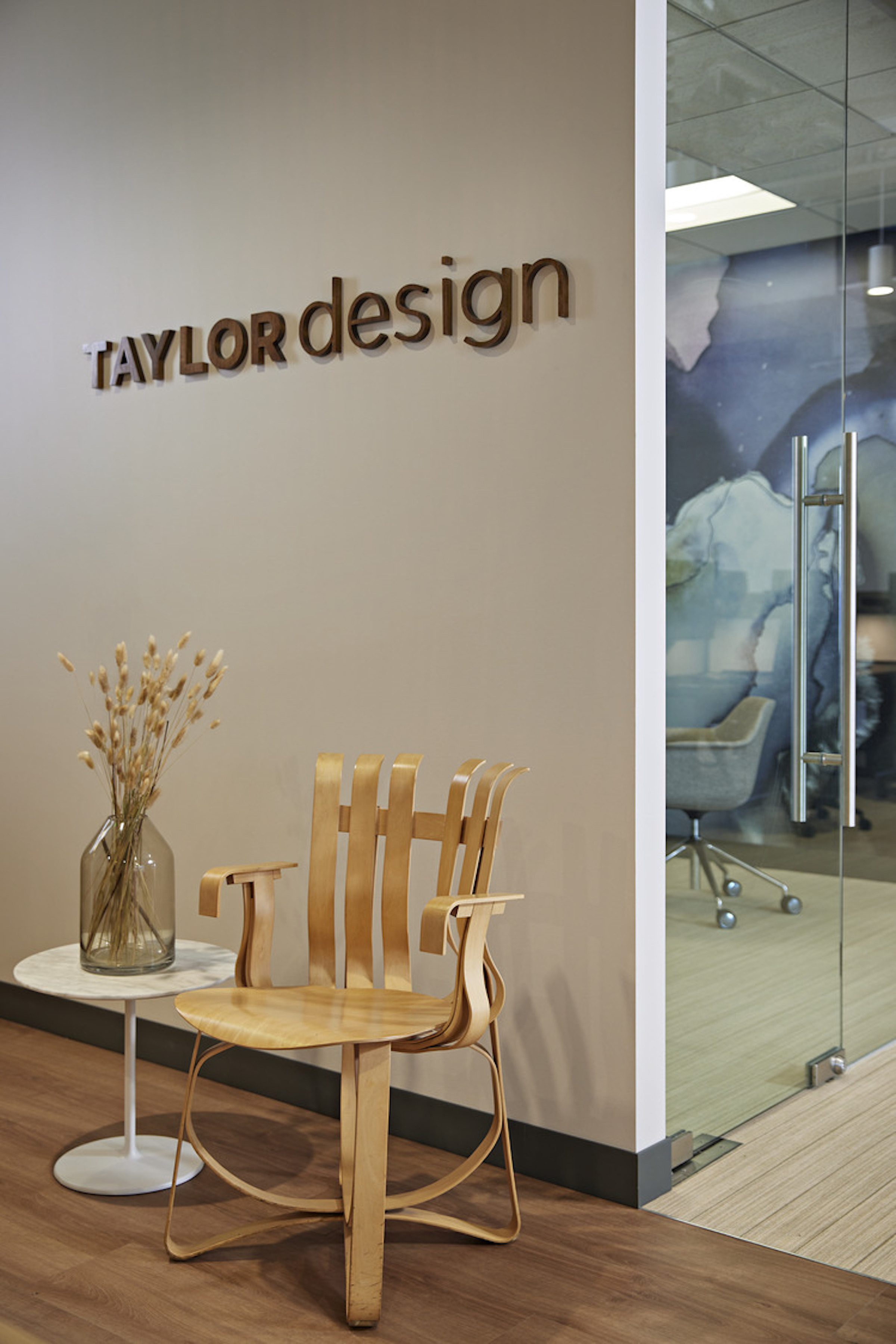
Should we concentrate the “30” in a single part of the office or spread it throughout? In some cases, but especially when the ratio is 90%-10%, the creative component is limited to one space – often the lobby. We decided quickly that we wanted to weave our 30% throughout the space. One of the ways we decided to represent the uniqueness of place within the context of Taylor Design was to ask our founder, Linda Taylor, to use her remarkable artistic talent to provide paintings that are specific to each location. As a result, her artwork graces multiple locations in each office. Also, with the full 30% to work with, we had sufficient room to convey our story in multiple areas, including deep into the space to help emphasize brand identity to visitors and to our staff.
Which design elements fall in both the 70% and the 30%? The theory of “Find Your 30” doesn’t require every design component to fall within one camp or the other; it can sometimes be in both. For example, in our office renovations, employees shared their personal inspirations with Linda Taylor to help stimulate the original artwork of each location. Commissioning Linda to contribute paintings falls in the 70% standard – each office will have a piece of her art. However, because each piece reflects the unique inspiration of the employees in the office, it also falls within the 30%. The same holds true for engaging with local community artists. Each office location worked with and commissioned an original piece of art from a community artist. As with our founder’s art, the community artist’s work is part of both the 70% and the 30%.
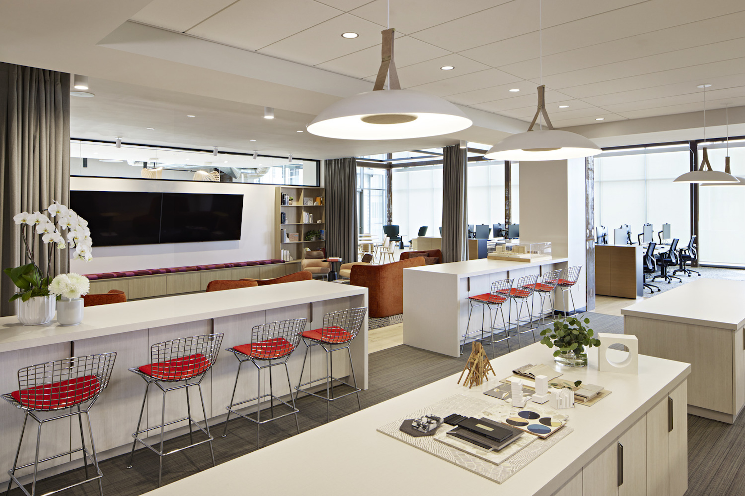
How should we get where we want to be? We held workshops featuring exercises that helped define the challenge of each space and seek solutions within the framework of Find Your 30. We used 70%-30% as an aid to determine whether a challenge or solution belonged to the rigid design standards of the former, or the freedom of expression in the latter. For example, we specified material, including natural grass and a graphic wallcovering, explicitly to illustrate to our clients’ how to introduce biophilia in sophisticated ways.
At the heart of it, Find Your 30 is about the experience of a place. Experience is defined by the culture – it’s the feeling you carry with you after you leave. It is the layering of information and how it eventually comes together as a cohesive story. It is about the things that make a space memorable. So when a design team adapts design standards appropriately and insightfully, within the context of the 70%-30% rule, the result is a space that supports and enhances your organization’s message, mission and values.
About the Author
Stephanie L’Estrange is Principal/Director of Interior Design for Taylor Design, a multidiscipline design firm with five offices in California.
Related Stories
| Aug 11, 2010
200 East Brady
Until July 2004, 200 East Brady, a 40,000-sf, 1920s-era warehouse, had been an abandoned eyesore in Tulsa, Okla.'s Brady district. The building, which was once home to a grocery supplier, then a steel casting company, and finally a casket storage facility, was purchased by Tom Wallace, president and founder of Wallace Engineering, to be his firm's new headquarters.
| Aug 11, 2010
Two Rivers Marketing: Industrial connection
It was supposed to be the perfect new office. In July 2003, Two Rivers Marketing Group of Des Moines, Iowa, began working with Shiffler Associates Architects on a 14,000-sf building to house their rapidly growing marketing firm. Over the next six months they put together an innovative program that drew on unprecedented amounts of employee feedback.
| Aug 11, 2010
AIA Course: Enclosure strategies for better buildings
Sustainability and energy efficiency depend not only on the overall design but also on the building's enclosure system. Whether it's via better air-infiltration control, thermal insulation, and moisture control, or more advanced strategies such as active façades with automated shading and venting or novel enclosure types such as double walls, Building Teams are delivering more efficient, better performing, and healthier building enclosures.
| Aug 11, 2010
Glass Wall Systems Open Up Closed Spaces
Sectioning off large open spaces without making everything feel closed off was the challenge faced by two very different projects—one an upscale food market in Napa Valley, the other a corporate office in Southern California. Movable glass wall systems proved to be the solution in both projects.
| Aug 11, 2010
Silver Award: Pere Marquette Depot Bay City, Mich.
For 38 years, the Pere Marquette Depot sat boarded up, broken down, and fire damaged. The Prairie-style building, with its distinctive orange iron-brick walls, was once the elegant Bay City, Mich., train station. The facility, which opened in 1904, served the Flint and Pere Marquette Railroad Company when the area was the epicenter of lumber processing for the shipbuilding and kit homebuilding ...
| Aug 11, 2010
Special Recognition: Durrant Group Headquarters, Dubuque, Iowa
Architecture firm Durrant Group used the redesign of its $3.7 million headquarters building as a way to showcase the firm's creativity, design talent, and technical expertise as well as to create a laboratory for experimentation and education. The Dubuque, Iowa, firm's stated desire was to set a high sustainability standard for both itself and its clients by recycling a 22,890-sf downtown buil...
| Aug 11, 2010
Thrown For a Loop in China
While the Bird's Nest and Water Cube captured all the TV coverage during the Beijing Olympics in August, the Rem Koolhaas-designed CCTV Headquarters in Beijing—known as the “Drunken Towers” or “Big Shorts,” for its unusual shape—is certain to steal the show when it opens next year.
| Aug 11, 2010
Top of the rock—Observation deck at Rockefeller Center
Opened in 1933, the observation deck at Rockefeller Center was designed to evoke the elegant promenades found on the period's luxury transatlantic liners—only with views of the city's skyline instead of the ocean. In 1986 this cultural landmark was closed to the public and sat unused for almost two decades.
| Aug 11, 2010
200 Fillmore
Built in 1963, the 32,000-sf 200 Fillmore building in Denver housed office and retail in a drab, outdated, and energy-splurging shell—a “style” made doubly disastrous by 200 Fillmore's function as the backdrop for a popular public plaza and outdoor café called “The Beach.
| Aug 11, 2010
Integrated Project Delivery builds a brave, new BIM world
Three-dimensional information, such as that provided by building information modeling, allows all members of the Building Team to visualize the many components of a project and how they work together. BIM and other 3D tools convey the idea and intent of the designer to the entire Building Team and lay the groundwork for integrated project delivery.


