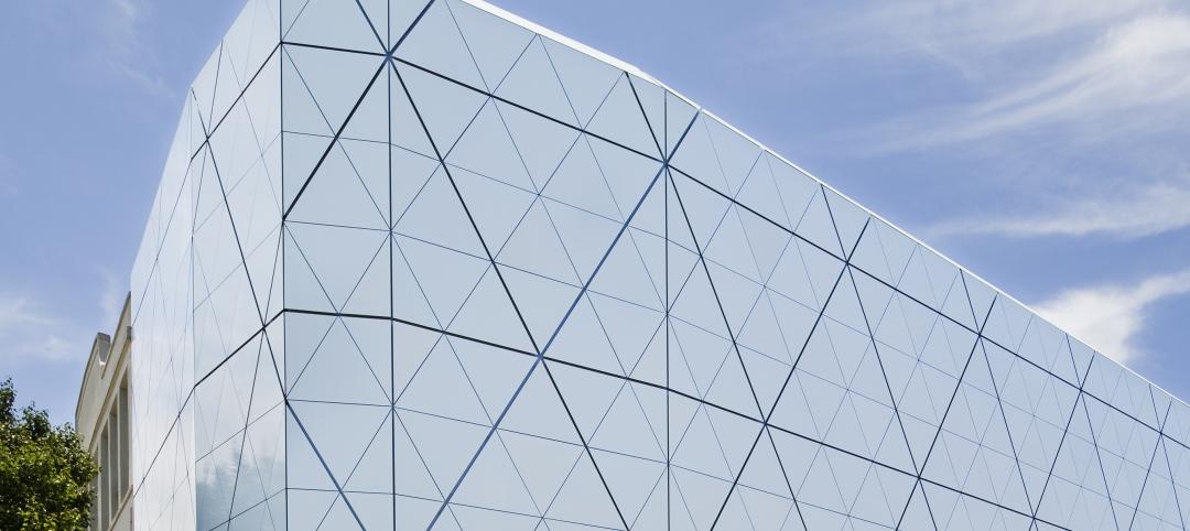
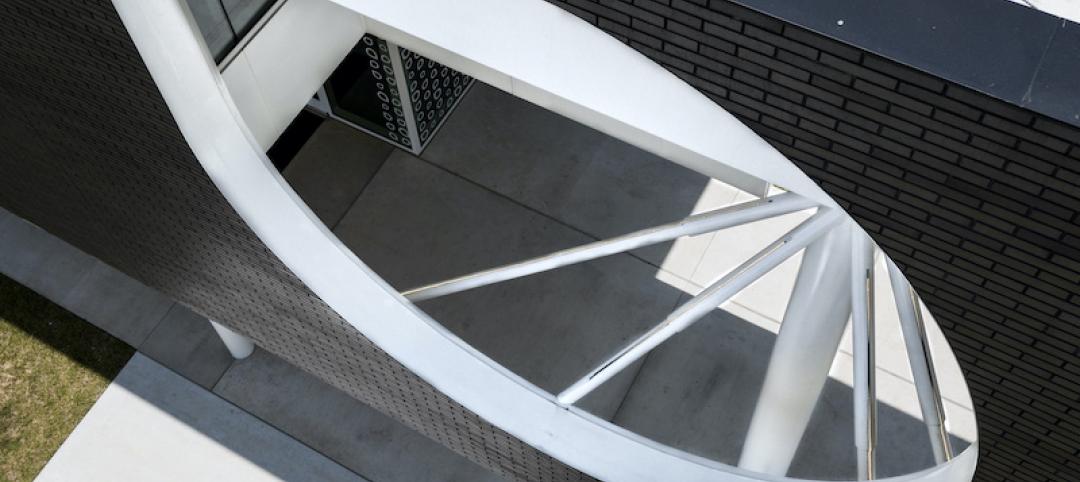
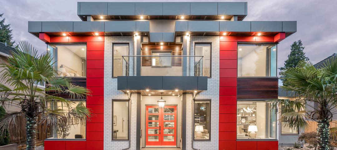
Color harmony, meaning the principle of colors working well together, is a significant component of design. Architects, designers and specifiers must strategically consider how colors will interact in their projects – whether in pops of color or subdued consistency.
What is color harmony?
To understand different types of color harmony, one must first determine the context in which the term is being used. Designers define and achieve color harmony in two distinct ways: through color matching or color wheel alignment.
- Harmonious color matching
The first color harmony definition relates to matching color across technologies and substrates. For example, one structure could include metal, plastic and fiberglass building products that all need to be the same color. Therefore, the coatings must be color-matched according to each unique substrate and the coatings technology applied.
Similarly, color harmony must also exist between the coil and extrusion application processes. Each process requires distinct formulations and codes that are carefully designed to achieve the same color in two different applications. - Harmony based on the color wheel
A classic method of understanding color harmony is through the color wheel. Placement on the color wheel is determined by a color’s tint, tone, saturation, chroma and luminosity. Designers use color wheel theories to determine which colors will work together harmoniously, or in other words, aesthetically.
Types of color harmony
For designers basing color harmony on the color wheel, there are different types of color harmony to choose from.
Monochromatic color harmony
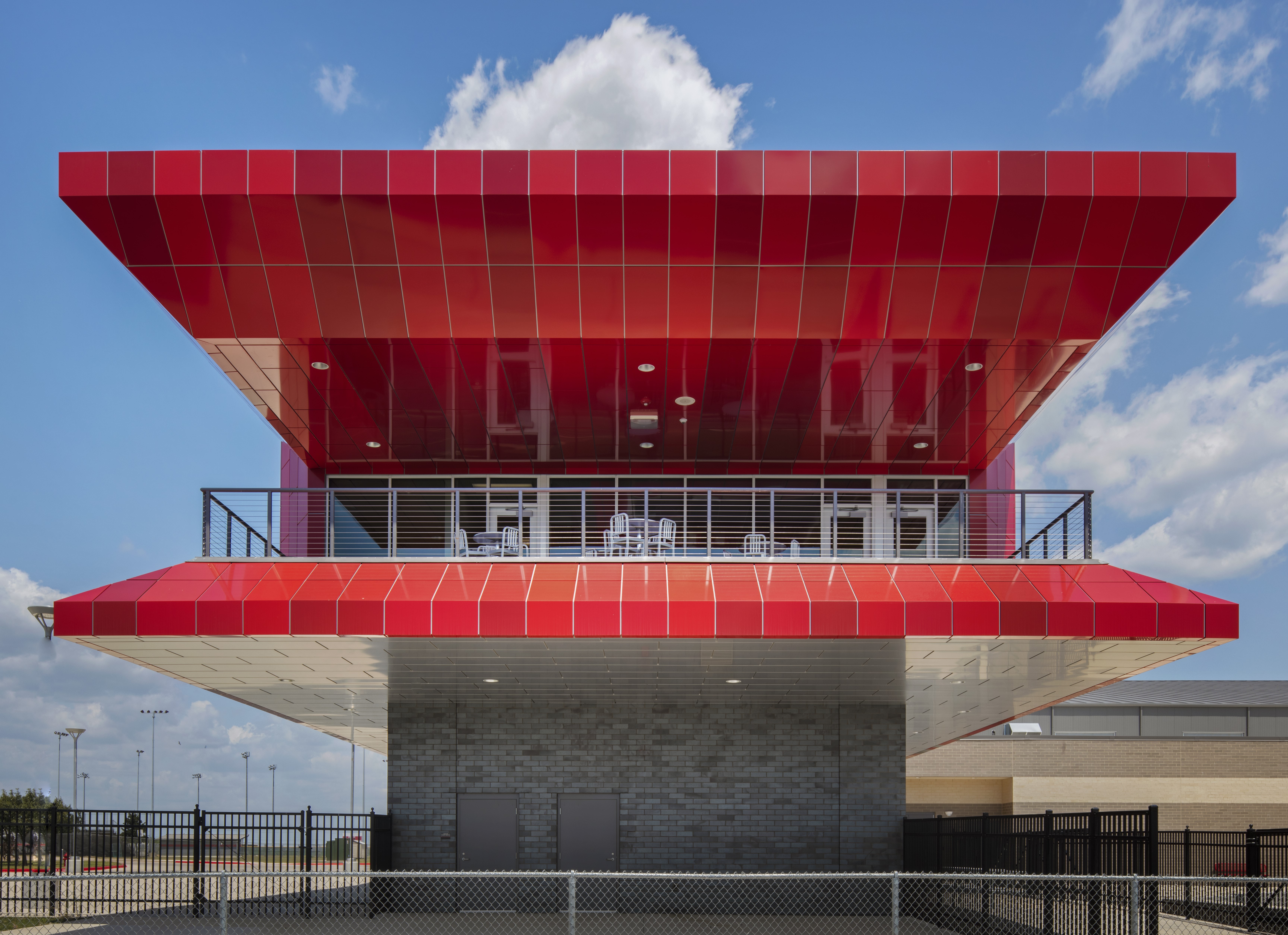
Monochromatic color harmony deals with shades deriving from one color family and is generally more subdued. The project could be a home in varying shades of blue, a hospital in degrees of white or a school facade in a spectrum of inky blacks to cool grays. For example, Del Valle High School used shades of red Fluropon® coatings for parts of the building, bringing a monochromatic design to its facade.
Analogous color harmony
Analogous color harmony spans two to three color families that sit adjacently on the color wheel. Like monochromes, analogous harmony schemes have lower contrast levels. The yellow-orange-red hues of autumn and the blue-green exterior paneling of SEI Investments are both analogous color harmony examples.

Complementary color harmony
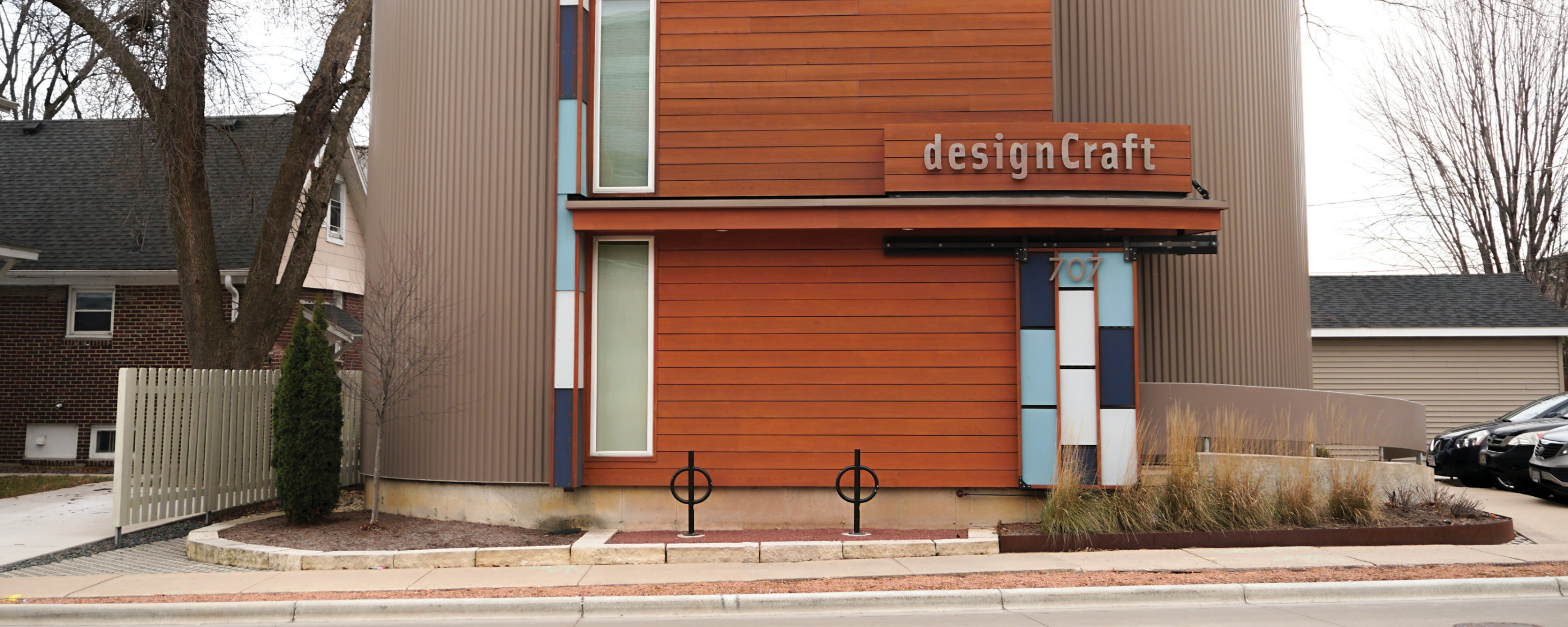
Colors that sit opposite each other on the color wheel create complementary color harmony. Examples include high-contrast pairings of pink and green, or blue and orange as distinguished in the designCraft office’s shades-of-blue doorway and rusty orange wall panels.
Split complementary color harmony
Going a step further, split complementary color harmony incorporates three complementary colors, which create a Y shape on the color wheel. Where pink and green create complementary color harmony, yellow can be added to achieve a split complementary design, as seen in the fun and colorful Give Kids the World Village.

Color harmony in architecture
Color harmony can shift and change to meet the needs of designers. The principle guides the foundations of design, yet still allows ample room for creativity. Designers are not limited to high or low contrasts and can combine colors to create complex neutrals such as grays, beiges and browns. Whether designers and manufacturers are looking to blend in or stand out, there is a spectrum of color combinations to support inventive designs.
- Inspiration for architects
At Sherwin-Williams Coil Coatings, our teams develop resources to assist designers, specifiers and manufacturers with their creative, colorful visions. Our color forecasts and market- and region-specific building product lookbooks provide carefully researched and deeply inspired tools to achieve harmonious color and design.
Contact a Sherwin-Williams color expert for support in your color and design journey.
Related Stories
Sponsored | Voice of the Brand | Aug 17, 2020
Can Sustainable Materials Compete With Virgin Material?
Sponsored | Voice of the Brand | Jul 28, 2020
Why Mineral Wool Makes the Grade as a Continuing Insulation
Sponsored | Voice of the Brand | Jul 2, 2020
Solving the Building Envelope Challenge
Today, solutions for the building envelope need to meet exacting standards on two equally important fronts – long-term performance and enduring aesthetic appeal. In this article, CENTRIA demonstrates how its products meet the standard in two different scenarios – construction of a new hospital in Asheville, North Carolina, and the addition to a popular museum in Pittsburgh.
Sponsored | Voice of the Brand | Jun 5, 2020
Practice Style Transcendence with Brick
Get inspired! Brick’s adaptability has made it the premier building material for centuries even as styles come and go. Nothing says “classic” like brick, but nothing says “innovative” like brick either. Check out some examples of how fired clay brick remains a major presence in the 21st Century designer’s palette.
Sponsored | Voice of the Brand | May 7, 2020
How One Fabricator Uses ALPOLIC MCM as His Calling Card in the Residential Market
ALPOLIC metal composite materials have been used in the architectural and commercial building worlds for years. But recently, architects are starting to specify it for residential and other non-traditional applications. With exceptional warranties and a variety of finishes, it is a perfect fit for homeowners wanting something different.
Sponsored | Voice of the Brand | May 5, 2020
Two Schools Go for Bold Color and Eye-Catching Design
Metal wall panel systems with varying rib patterns and pops of color provide dynamic visual interest in two different new-construction school buildings. PAC-CLAD Precision Series Panels offer an affordable array of 45 standard colors and 12 panel options for endless cladding possibilities.
Sponsored | Voice of the Brand | Mar 10, 2020
How Trim-Tex’s Fast Edge® corner bead saves time & material
Trim-Tex recently rolled out its latest vinyl corner bead innovation, Fast Edge®, promising to drastically cut down on the time and material it takes to finish drywall corners. How much can these corner beads actually save contractors? They put it to the test!


