


Personalized medicine is a watchword in modern healthcare. Hospital systems are under enormous pressure to achieve better clinical outcomes. They are responding in part by developing a deeper understanding of the behavior of individual patients—a goal that is shaping facility design as well.
Increasingly, owners want their facilities to provide a competitive edge by making patients feel affirmed and comforted from the moment they reach the front door. Like the practice of medicine itself, however, healthcare lobbies are far from a one-size-fits-all proposition.
“There’s been a trend in the major medical centers to look at the facility as a ‘distinctifier’ for patients, as an opportunity to solidify their brand identity in healthcare,” says Kate Wendt, IIDA, Director of Interior Design and Associate Principal at Tsoi/Kobus and Associates (www.tka-architects.com). According to Wendt, a patient’s first impression can also have significant psychological implications. “Depending on what is going on with them, most patients are a little anxious, and we do a lot to try to subtly relieve stress via the lobby,” she says.
TK&A Senior Interior Designer and Associate Chu Foxlin says that patients’ access to healthcare information, and their growing ability to navigate among providers in a crowded marketplace, is also influencing hospital administrators’ ideas about lobbies. “The physical environment offers important branding opportunities in managing increasing competition, responding to a savvier patient population. The lobby needs to convey ‘who we are’ and ‘why you should come here for care.’”
Many healthcare systems are using patient surveys and individual interviews to make sure evidence-based design extends beyond the clinic, OR, and ER. “They’re all trying to understand, from a marketing standpoint, why people come where they come for treatment,” says Wendt.
DON'T DO HEALTHCARE WORK? See our six lobby lessons for non-healthcare projects
If you do hotels, schools, student unions, office buildings, performing arts centers, transportation facilities, or any structure with a lobby, here are six principles from healthcare lobby design that make for happier users—and more satisfied owners. Read 6 lobby lessons for non-healthcare projects.
“They’re also trying to recruit and retain the best staff. They’re working with input from their internal user groups, and often there is also a donor with a weigh-in on the final look of the project.”
While all public lobbies require a design response to basic issues of access and egress, security, wayfinding, and maintenance, healthcare lobbies call for special considerations, notably:
• Infection control
• Diminished concentration among patients and visitors due to heightened anxiety and stress
• Beefed-up safety measures to protect frail, disabled, or vision-impaired patients
Four recent TK&A projects illustrate a detail-oriented approach, with spaces that reflect very different patient populations and owner objectives.
1. Hope and inspiration in a hypercompetitive market

The lobby reception desk and working fireplace at the Duke Cancer Center are situated in a low-ceilinged area that brings a human scale to the entry. Behind the wood wall, patients find an easy-to-navigate suite of services, including a pharmacy and a wig and prosthetics shop. A café is also within easy walking distance. PHOTO: ROBERT BENSON PHOTOGRAPHY
The 267,000-sf Duke Cancer Center at Duke Cancer Institute, Durham, N.C., opened in 2011 to provide integrated clinical and support services. Patients can see all their caregivers at a single site, from doctors and nurses to pharmacists, social workers, dietitians, and providers of prosthetics and wigs.
Patients in North Carolina’s Research Triangle have multiple choices for high-quality care. The lobby design immediately establishes the Cancer Center’s branding, a message that was influenced not only by patient input but also by Building Team tours of other major cancer centers. “There was an extensive amount of front-end work with this project,” says Wendt. “We did a lot of benchmarking to figure out what to do in the lobby."
The primary feature is a five-story atrium, fulfilling Duke’s request for a light, bright, cheerful space. A custom wood screen incorporating pointed arches suggests a cathedral-like serenity and also functions as a clear point of orientation. It extends to a lower level, where the radiology department is located.

Duke patients were asked to submit inspirational sayings, which were used to create a permanent art display in the terrazzo floor of the lower-level radiology department. Radiology has its own entrance; the artwork is the centerpiece of the secondary lobby. PHOTO: ROBERT BENSON PHOTOGRAPHY
To balance the scale of the atrium, the Building Team created an adjacent two-story lobby with a reception desk, soft seating, and a working fireplace that honors donors. “North Carolina is not always warm, and they thought a fireplace was a nice idea for crisp days,” says Wendt. “It’s intended to convey a more homelike feeling.” A café, a wig and prosthetic boutique, a patient learning center, and the pharmacy are all located nearby.
Putting everything in an easy-to-reach, easy-to-navigate space is a reflection of Duke’s long history of involvement with cancer patients’ physical and emotional needs, but a lot of market research went into the lobby, too. “The design involved the healthcare campus architect, the CEO, the COO, and the nursing staff, as well as user group studies,” says Wendt. “They gave us a very detailed report regarding patient desires.”
2. Neighborhood healthcare suits a changing urban environment
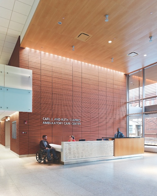
The signature terra cotta rainscreen at Shapiro continues seamlessly into the lobby, orienting visitors to the reception desk and elevators. Wheelchair access and storage are a key consideration for healthcare lobby design; here, a low Corian counter is a suitable height for the seated patient. PHOTO: JEFFREY TOTARO
The Carl J. and Ruth Shapiro Ambulatory Care Center consolidates outpatient diagnostic and therapeutic services at Boston Medical Center. Opened in 2011, the nine-story, 245,000-sf facility occupies a highly visible site at the edge of the BMC campus, bordering venerable low-rise residential buildings. Respecting the neighborhood context, serving an inner-city population, and attracting private patients were top-of-mind goals for the Building Team.
BMC was created in 1996 from a merger of the public Boston City Hospital and the private Boston University Medical Center Hospital. “About 70% of BMC patients come from under-served populations,” including low-income families, elders, people with disabilities, minorities, and immigrants, according to Robert Biggio, BMC’s VP of Facilities and Support Services. The design team worked with the donors and BMC officials to create a supportive, safe, and durable environment.
Light, warm wood finishes predominate in the daylit lobby, combined with a terra cotta wall that extends from the exterior façade. The need for tough finishes is reflected in the reception desk, which incorporates metal panels and Corian worksurfaces, and in the patient furniture, where wood and heavy-duty vinyl predominate. Except for a small, carpet-tiled seating zone, the floors are terrazzo, which withstands heavy cleaning and abuse. Artificial bamboo offers a touch of nature without the maintenance demands of real plants; it draws patients toward an open staircase leading to a small café. Murals depicting local history reinforce the founding institutions’ deep roots in the neighborhood.
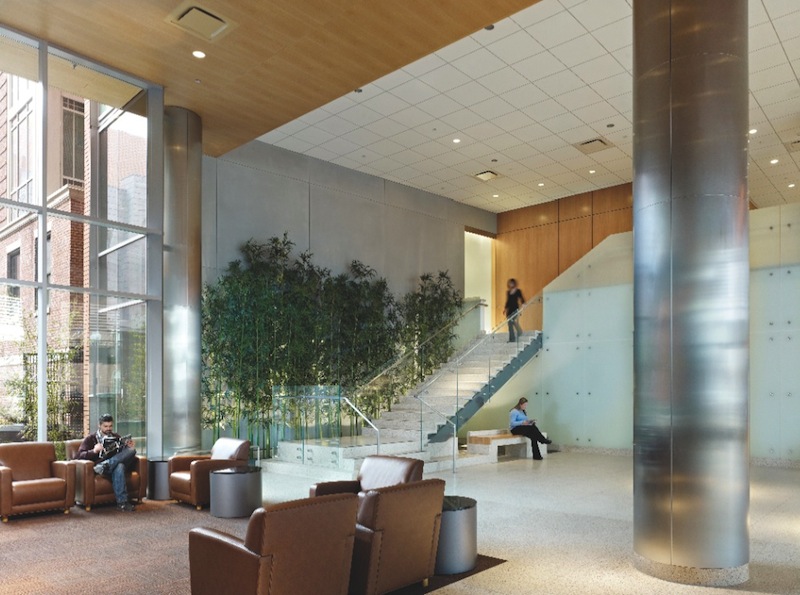
Natural materials, light, and thoughtfully divided activity zones help the Shapiro lobby feel like a calming oasis. The open staircase, acccented with artificial bamboo, leads to a small café. A glass feature at the landing mimics a waterfall without the maintenance hassles of a real water feature. PHOTO: JEFFREY TOTARO
With a large non-English-speaking population, wayfinding was a crucial consideration. Much of the signage is multilingual, but orientation does not rely completely on verbal skills. “The patient elevator bank, primary circulation corridor, and all the waiting rooms are located along a curtain wall so that patients will always know where they are in the building and in relationship to the exterior as they enter or exit a clinical suite,” says Biggio.
TK&A’s Wendt explains further: “Lobbies can get crowded, and as hard as we try to make it intuitive, people coming to medical facilities are distracted and can miss some visual cues.” Because medical buildings are complex spaces, you have to keep telling the wayfinding story. “We try to make lobby elevators especially clear and obvious, in terms of materials and ceiling treatments,” she says.
For the Shapiro project, all elevator lobbies were accented with wood ceilings and identical light fixtures. Card readers control access at key entries and exits and within the building, as well as at storage and supply closets.
The Shapiro building is a crucial piece in BMC’s plan for growth, and the lobby—with finishes reminiscent of an upscale hotel—reinforces this fact. “Ambulatory care is an increasingly important component of the services BMC provides,” says Biggio. “The design needed to be patient-centered within a friendly environment.”
[PAGEBREAK]
3. Simplicity serves hospital’s vision-impaired clientele
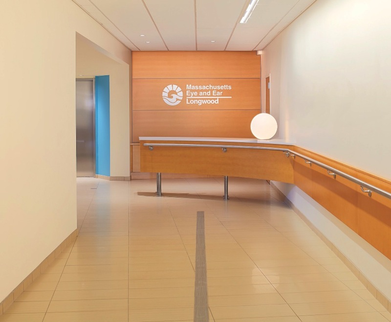
As part of a zoning agreement with city officials, the Mass. Eye and Ear optical shop and café are open to the general public, with a street-level entrance separate from the institution’s primary lobby. PHOTO: BRUCE T. MARTIN PHOTOGRAPHY
Massachusetts Eye and Ear Infirmary, a Boston hospital specializing in eye, ear, nose, throat, head, and neck disorders, took a very different approach for a recent adaptive reuse project. The Building Team transformed an existing lab facility near the Longwood Medical Area through a vertical expansion and addition, anchored by a modest but carefully detailed lobby.
“The design tries to compensate for patients’ issues with depth perception, color perception, and various levels of vision impairment,” says Wendt.
To prepare for the project, the Building Team visited Perkins School for the Blind. They wore glasses that simulate vision disorders to gain a first-hand sense of impairments that patients are coping with.
The resulting lobby is well-lit and clear of obstacles. A small two-story atrium and bridge visually connect the clinical ophthalmology services with ground-level services. Pale flooring and walls contrast with clean-lined, brightly colored seating. A handrail helps patients find their way along the entry corridor to the main desk, and baseboard guides for canes have been strategically placed. Interior glazing includes horizontal mullions near eye level to provide additional cues.
The handrail and floor pattern at the Massachusetts Eye and Ear Infirmary offer important wayfinding cues for visually impaired patients. Students from the Massachusetts College of Art are sometimes invited to hang their work in the entry corridors. PHOTO: BRUCE T. MARTIN PHOTOGRAPHY
“It may all look spartan, but you don’t want to clutter up the path of travel when users are vision-impaired,” says Wendt. “The lines in the floor provide a direct contrast to help with wayfinding.”
Urban design guidelines for the city of Boston directed placement of an optical shop and café at ground level, with a separate street entrance. “That was part of the city’s rule for allowing this facility in a quasi-residential neighborhood, so it would be viewed as an amenity and a convenience,” says Wendt.
Massachusetts Eye and Ear’s Clinical Director, Carolyn E. Kloek, MD, says, “The simplicity and clarity of the spaces make a pleasant and calming lobby. The center is built into a hill, so it was imperative that light filter from the second floor into the first-floor lobby, which is partially below grade. Hospital lobby designs are using more open spaces and bright colors to make the environment warmer and more inviting, and to make the patients feel more at home.”
4. Cheerful spaces keep children safe—and busy
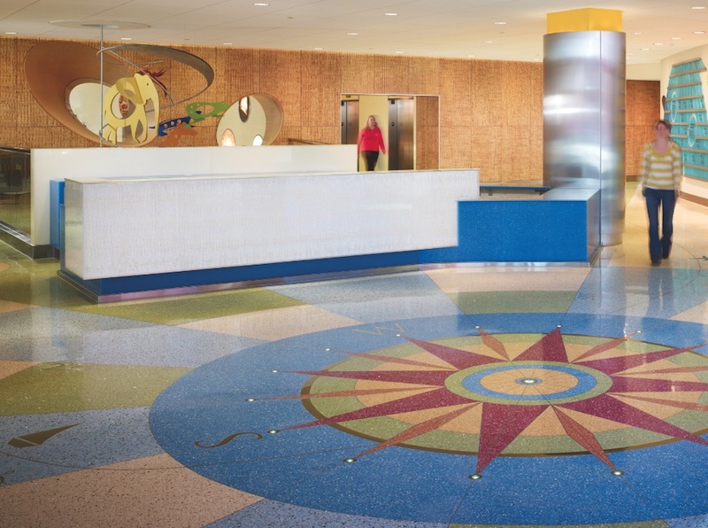
Upon arrival at the University of Minnesota Amplatz Children’s Hospital, patients see a color-saturated terrazzo compass with sunken lighting, introducing the “Passport to Discovery” theme. Architecturally integrated thematic elements and environmental graphics, featuring animal icons and habitats, aid in wayfinding; the theme is introduced by artwork at the reception desk. PHOTO: NICK MERRICK / HEDRICH BLESSING
Pediatric patients have a distinct mix of traits that influence design, according to Kathie Taranto, President of the University of Minnesota Amplatz Children’s Hospital. “Children are always learning from their physical environment, so they respond favorably when there are interesting things to do and see. The ability to interact with the environment can promote comfort, distraction, and a sense of control for children when they enter a place that could otherwise be scary or anxiety-provoking.”
Two years ago the university, in partnership with Fairview Health Services, opened a new 227,000-sf, 96-bed replacement facility that provides more than 50 pediatric services. “The old lobby was very dark and totally different,” says Wendt. “The client asked us to have families and children give input on the colors we were considering, including the saturation levels.” The brightly daylit lobby is accented with hot pinks, blues, and yellows, with final fabrics and finishes chosen by an in-house facilities group.
Wendt says the hospital wanted to avoid traditional “Minnesota” décor that references lakes, local wildlife, and the North Woods. Instead, the theme “Passport to Discovery” was selected, symbolized with a compass rose in the center of the lobby’s terrazzo floor. Animal icons, usually species with some tie-in to medical research, serve as identifying features throughout the building. Cut-out, backlit graphics and color-coded informational signboards give each floor its own “habitat” and signature animal.
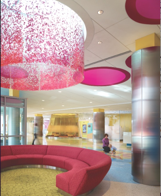
Creative seating, flooring, and custom light fixtures offer positive distractions in the Amplatz lobby. The one-story space makes a pleasant setting for musical performances, storytelling, and puppet shows. A yellow glass enclosure (rear) provides privacy for reading and quiet play, while keeping children visible to families. PHOTO: NICK MERRICK / HEDRICH BLESSING
Clear traffic paths lead families through the lobby to the parking garage, resource center, public elevators, and a coffee and juice bar. Interactive monitors keep children busy coloring digital “pages,” or taking pictures of themselves and uploading them to a big-screen display that makes the hospital feel more personal.
First and foremost, a children’s hospital must be secure. Entry to patient-care units is possible only through the lobby, with a security check-in and issuance of ID badges at the main desk. A cylindrical enclosure, formed by yellow glass walls and equipped with low seating, creates a safe space-within-a-space where patients can enjoy reading or quiet play without being out of their families’ view.
“The first impression is important to the overall patient experience, particularly for children,” says Taranto. “We wanted a physical environment that reflected the spirit of children yet was welcoming to all ages. Light and bright colors and varying materials and textures are pleasing to the eye and allow people to see something interesting wherever they look.”
Today’s hospital lobbies are a far cry from the nondescript spaces common in the recent past. Foxlin believes competitive pressures will continue to push change. “Patients, families, and staff are becoming more sophisticated in taste and are demanding a more sophisticated healthcare building,” she says. “The lobby is now considered an important extension of the care-giving environment.”
Related Stories
| Aug 11, 2010
Polshek Partnership unveils design for University of North Texas business building
New York-based architect Polshek Partnership today unveiled its design scheme for the $70 million Business Leadership Building at the University of North Texas in Denton. Designed to provide UNT’s 5,400-plus business majors the highest level of academic instruction and professional training, the 180,000-sf facility will include an open atrium, an internet café, and numerous study and tutoring rooms—all designed to help develop a spirit of collaboration and team-oriented focus.
| Aug 11, 2010
University of Florida aiming for nation’s first LEED Platinum parking garage
If all goes as planned, the University of Florida’s new $20 million Southwest Parking Garage Complex in Gainesville will soon become the first parking facility in the country to earn LEED Platinum status. Designed by the Boca Raton office of PGAL to meet criteria for the highest LEED certification category, the garage complex includes a six-level, 313,000-sf parking garage (927 spaces) and an attached, 10,000-sf, two-story transportation and parking services office building.
| Aug 11, 2010
Draft NIST report on Cowboys practice facility collapse released for public comment
A fabric-covered, steel frame practice facility owned by the National Football League’s Dallas Cowboys collapsed under wind loads significantly less than those required under applicable design standards, according to a report released today for public comment by the Commerce Department's National Institute of Standards and Technology (NIST).
| Aug 11, 2010
Callison, MulvannyG2 among nation's largest retail design firms, according to BD+C's Giants 300 report
A ranking of the Top 75 Retail Design Firms based on Building Design+Construction's 2009 Giants 300 survey. For more Giants 300 rankings, visit http://www.BDCnetwork.com/Giants
| Aug 11, 2010
USGBC honors Brad Pitt's Make It Right New Orleans as the ‘largest and greenest single-family community in the world’
U.S. Green Building Council President, CEO and Founding Chair Rick Fedrizzi today declared that the neighborhood being built by Make It Right New Orleans, the post-Katrina housing initiative launched by actor Brad Pitt, is the “largest and greenest community of single-family homes in the world” at the annual Clinton Global Initiative meeting in New York.
| Aug 11, 2010
AIA report estimates up to 270,000 construction industry jobs could be created if the American Clean Energy Security Act is passed
With the encouragement of Senate majority leader Harry Reid (D-NV), the American Institute of Architects (AIA) conducted a study to determine how many jobs in the design and construction industry could be created if the American Clean Energy Security Act (H.R. 2454; also known as the Waxman-Markey Bill) is enacted.
| Aug 11, 2010
Architect Michael Graves to be inducted into the N.J. Hall of Fame
Architect Michael Graves of Princeton, N.J., being inducted into the N.J. Hall of Fame.
| Aug 11, 2010
Modest rebound in Architecture Billings Index
Following a drop of nearly three points, the Architecture Billings Index (ABI) nudged up almost two points in February. As a leading economic indicator of construction activity, the ABI reflects the approximate nine to twelve month lag time between architecture billings and construction spending.


