

In an environment where the chief task is to heal the sick and injured, color matters for both patients and healthcare personnel. In the report, “The Application of Color in Healthcare Settings,” by the Center for Health Design (CHD), healthcare design experts point to the influence of color in a variety of environments within healthcare facilities. From bright, open-air lobbies to neutral-toned operating rooms, there are many spaces where carefully selecting color can maximize comfort for occupants.
About the Report
“The Application of Color in Healthcare Settings” serves as a reference for architects and designers with regards to the application of color to healthcare spaces. Released October 2012 by The Center for Health Design, the report looks at studies of color in a variety of healthcare settings and offers insight on applicable color topics.
Authors:
Sheila J. Bosch, LEED AP, EDAC, Director of Research at Gresham, Smith, and Partners;
Rosalyn Cama, FASID, EDAC, President and Principal of CAMA Inc.
Eve Edelstein, Assoc. AIA, EDAC, F-AAA, President of Innovative Design Science
Jain Malkin, CID, AAHID, EDAC, President of Jain Malkin Inc.
1. Patient rooms: Make patients feel at home
There lacks a universally accepted consensus that colors can actually “help” patients heal, according to the study’s authors. Nevertheless, colors will be used to evoke certain emotions or moods. In a 1994 study of 68 subjects, all patients indicated a preference for lighter hues for their rooms—from the ceilings and floors to the furniture and linens.
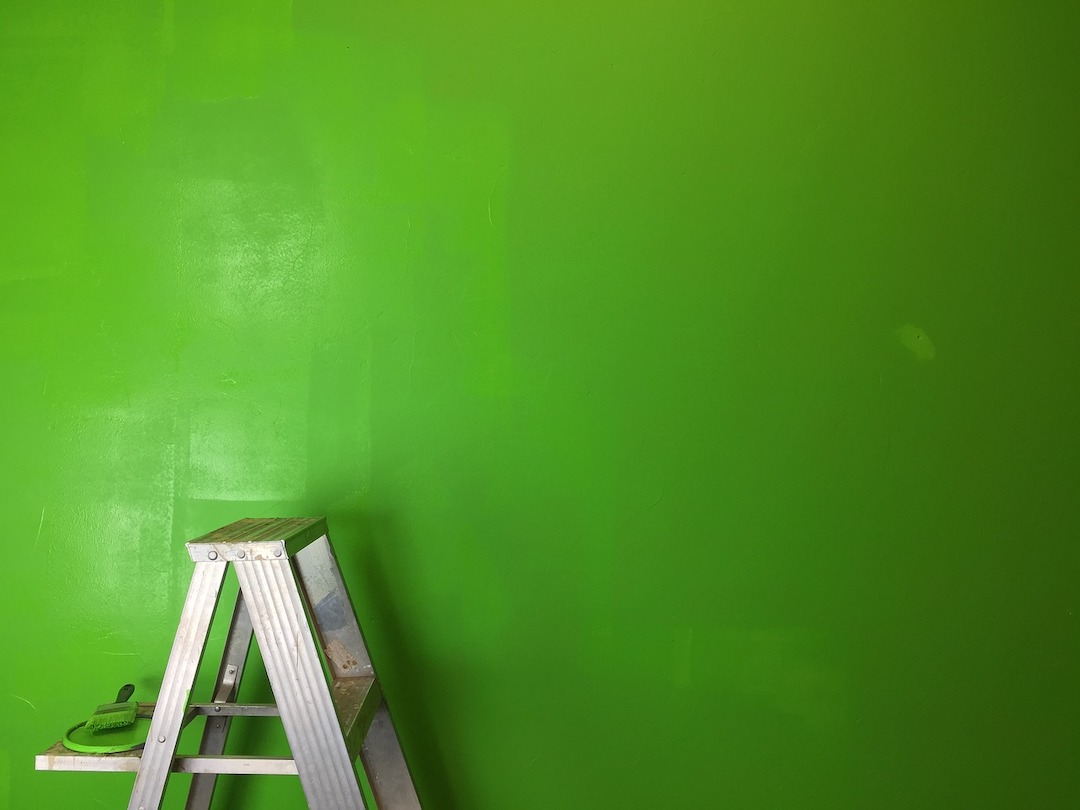
Neutral palettes with soft natural tones work best for patient rooms and can have a hand in calming patients and their family members faced with the stress of having an ill loved one, according to the study. Avoid using palettes with strongly contrasting colors in these spaces, as they are known to cause strain for occupants.
Similar design considerations should be made where patients and their family members will spend time, such as waiting areas in emergency departments.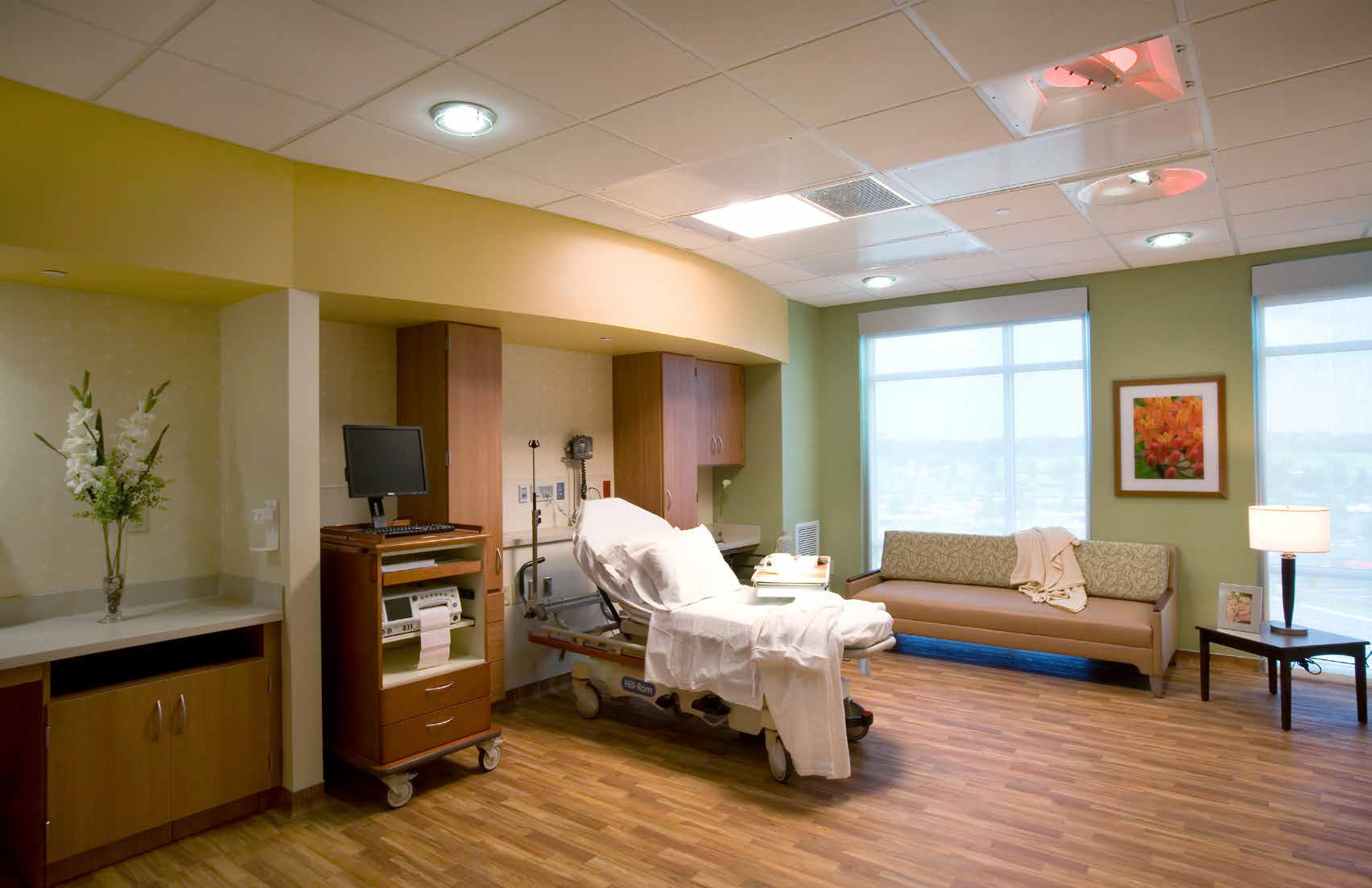
2. Employee spaces: Increase comfort for doctors and nurses
Professionals providing the care in healthcare environments are known for working long, stressful shifts, standing for hours on end. They need places of respite to rest and recharge. Brightly lit rooms with stronger color palettes can help those needing a quick break to stay fresh and lively. Darker, subtler break rooms with softer lighting are preferred by many workers looking to rest for longer periods of time.
3. Operating rooms: Neutralize the reds
In the operating room, surgeons and surgical nurses are focused on one color: blood red. While white is traditionally seen as the institutional color of choice, more often than not operating rooms will require the use of blue or green on the walls to contrast against the red. (There’s a reason hospital scrubs are commonly colored blue or green.) Viewing one color for a specific amount of time will produce an image of a complementary color afterward (called afterimages), so it is best to avoid stark white backgrounds, say the authors. With white walls, surgeons would constantly see blue-green spots when looking away from the operating table.
4. Accommodations: Consider patient conditions and age
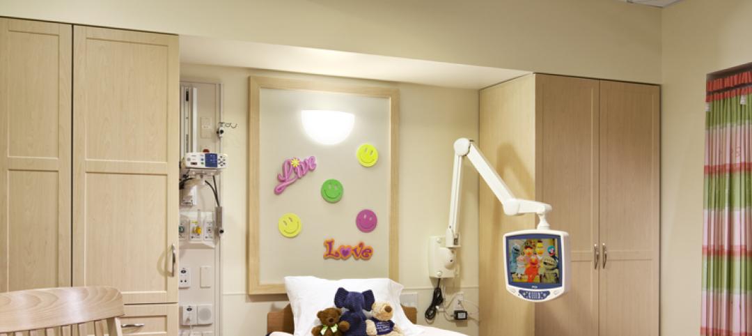
Children’s hospitals are often colorful and bright in their design to help pediatric patients feel at home during their stay. In contrast, nursing homes are softer and more neutral. With elderly populations, vision is changing and deteriorating, so greater contrast is needed to help guide patients through their rooms. Consider saturated colors over pastels, which can blur together in patients with poorer eyesight.
Take into account the medical conditions of certain patients. One example in the CHD report is jaundice, or yellowing of the skin. Doctors and nurses treating those with the condition may find difficulty while assessing patients if yellow and blue walls or surfaces are dominant.
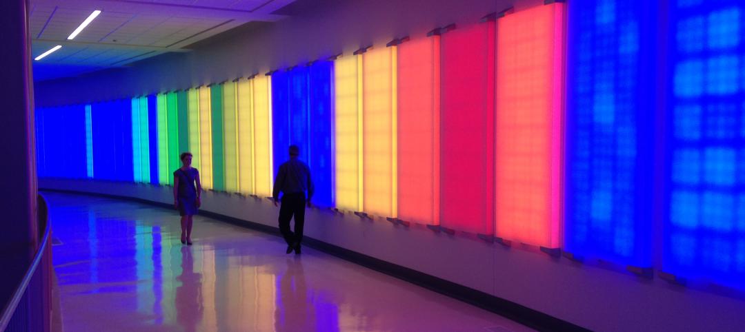
5. Color psychology: Apply colors to different spaces
While there is no concrete scientific evidence supporting its effects, the use of color psychology can help enhance the function of a space or room. Natural colors, such as green, blue, or brown, are seen as calming, and can signal the designation of a room. Red, while a stimulating color especially for creative types, is often avoided in facilities that treat neurological conditions or patients suffering from ailments such as post-traumatic stress disorder.
Related Stories

Sponsored | | Apr 26, 2017
Advancements in Materials Open Up Color Trend Possibilities
For color experts, predicting trends before they happen requires a trained eye and being able to understand people

Urban Planning | Jul 19, 2016
New game challenges players to create a utopian city block
By treating the neighborhood as a living entity, players of Block’hood take part in the creation, death, and rebirth of their own city blocks

Sponsored | Color Innovations Series | Aug 9, 2015
Campus Branding With Color
Iconic and identifiable colors play role in higher ed branding on campuses. - See more at: http://www.bdcnetwork.com/campus-branding-color#sthash.ijEP68Iy.dpuf

Sponsored | | May 22, 2015
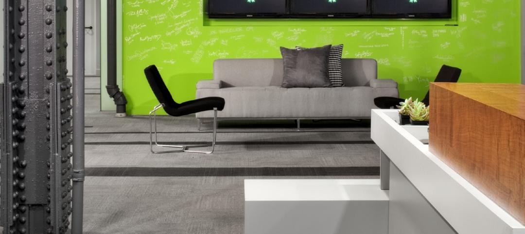
Shades of Gray—And One Green
Many companies utilize their signature colors for the exterior and interior of their office suites, buildings, and more. But for a product strategy and design firm in Austin, Texas, just one simple hue was needed to represent the brand.

Sponsored | Coatings | May 6, 2015
Color and Contrast in the Built Environment
Because color is incredibly subjective, personal and situational, it is difficult to study scientifically. There is no conclusive evidence to fully support one color’s beneficial effects on the human mind and body over another color.
Sponsored | Coatings | Apr 20, 2015
Wayfinding With Color
Color’s prominent role in wayfinding has become a focus in architecture, as color association is strong and memorable for regular occupants and occasional visitors alike.
Sponsored | | Mar 23, 2015
Brightening Young Minds with Color
Education is changing, and school design is changing with it. The old-fashioned classroom, filled with rows of front-facing desks, is giving way to other types of learning spaces.


