


Because color is incredibly subjective, personal and situational, it is difficult to study scientifically. There is no conclusive evidence to fully support one color’s beneficial effects on the human mind and body over another color. We each have our personal associations, cultural backgrounds, and even our own eyes’ abilities to differentiate colors, which vary from person to person and change as we age (for instance—did you know the lens inside our eyes tend to yellow as we get older?).
It’s been said that pink can reduce aggression in prison inmates, or that light green is calming and neutral and therefore good for hospitals and schools. The overuse of any color will lead to saturation and monotony that decreases brain activity by being visually unstimulating. However, there are recent studies that narrow their scope to look at some specific, isolated situations that apply to architecture and design.
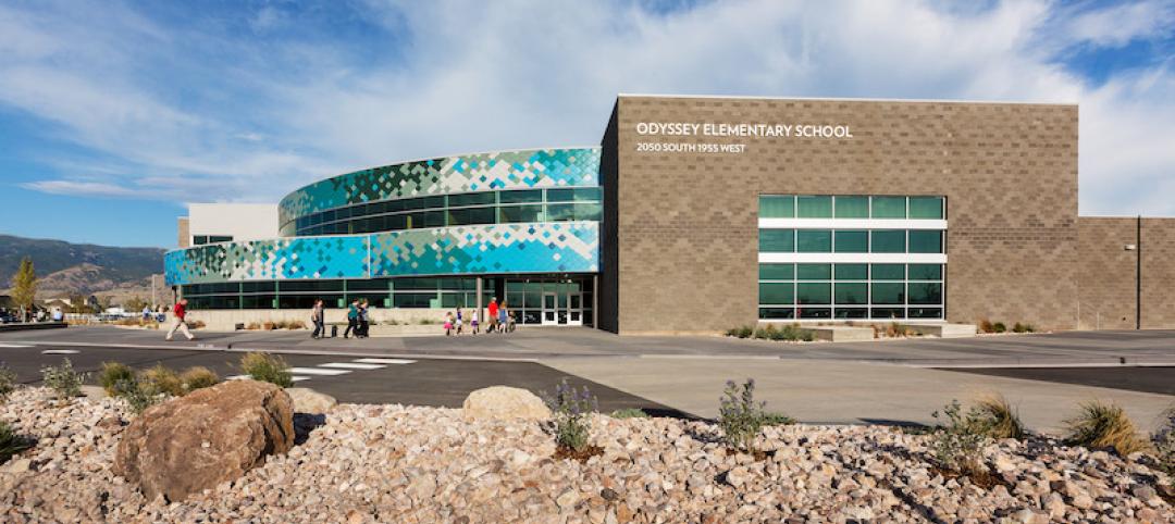
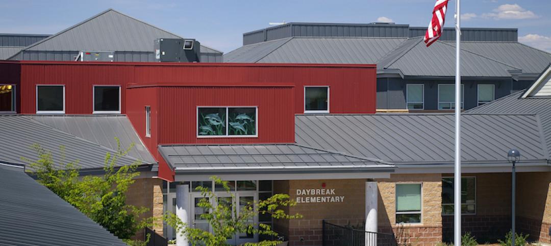
For instance, as autism awareness becomes increasingly prevalent, there are studies and personal testimony that point to the color red, in its primary form, as being seen as super-intense, fluorescent or pulsating by some persons on the autism spectrum. For many schools—which act as a bridge from home to the outside world for these students—there is a great deal of pressure to respond to the needs of those with sensory issues and to avoid large expanses of the environment being painted in bright red. Red can be used effectively in smaller objects during occupational therapy sessions, allowing the child to adapt to the stimulus.
For those who are looking to spur innovation in the corporate world, that bright, primary red has also been shown in a University of British Columbia study to increase attention to detail, improving proofreading accuracy and alertness to errors. This is in contrast to the color blue, which the same study identified as boosting performance on creative tasks like brainstorming.
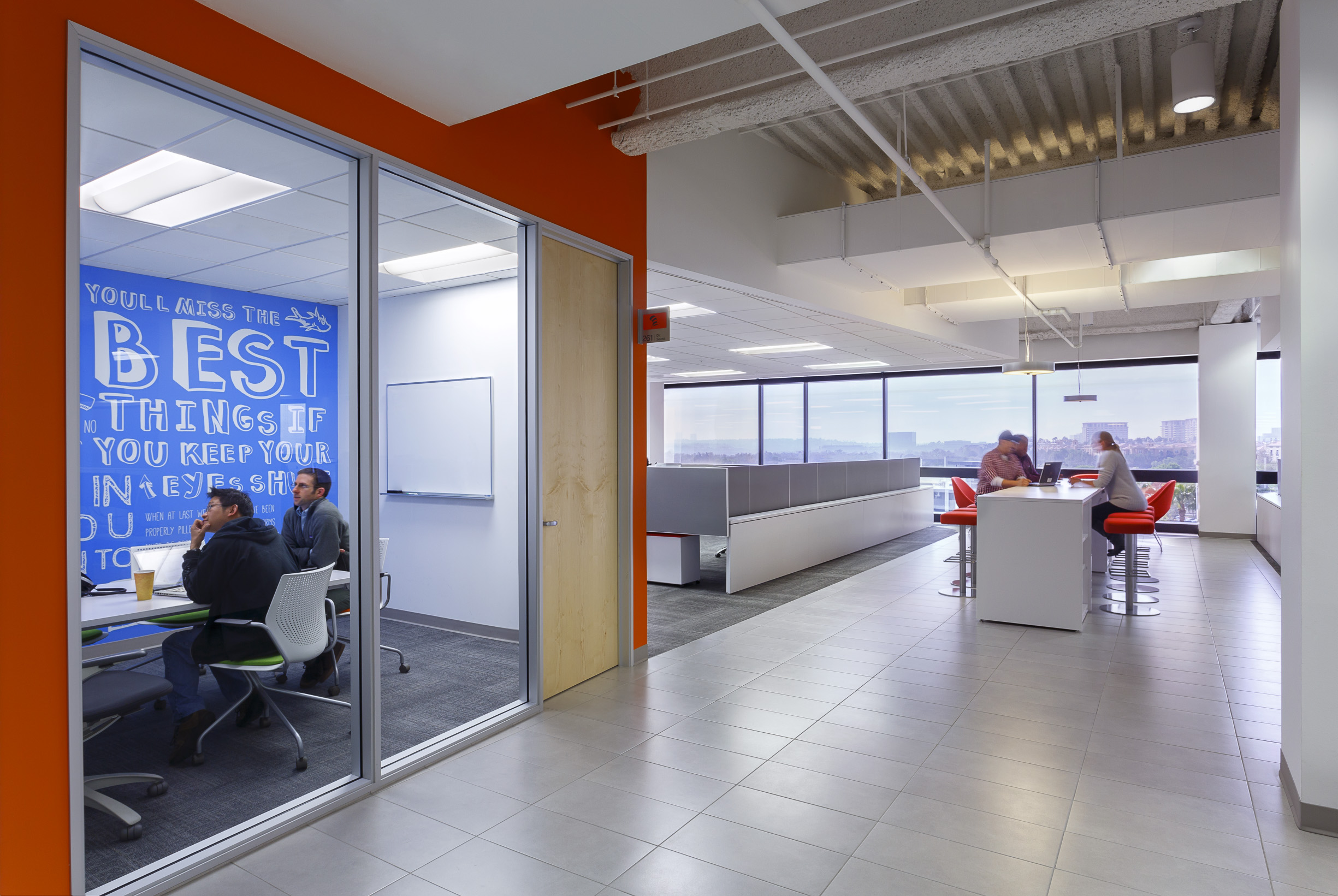
In one example, medical office software provider Kareo engaged LPA Inc. to design its new 45,450-sf headquarters at Park Place in Irvine, Calif. To accommodate the company’s rapid expansion, LPA helped envision and create a highly flexible and creative work environment that would expand and evolve to support the company and its clients’ needs. Bold uses of color and contrast were implemented throughout the office, with hues of blue and orange strategically placed to promote creativity, brainstorming and alertness.
Aside from encouraging creative responses, the color blue is also being used for outdoor lighting in many places, including Scotland and Japan, due to its association with police and security and the deterrence of criminal activity.
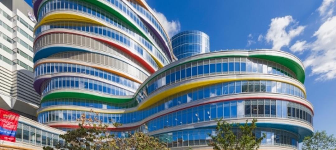
While these previous examples focused on the benefits of any one hue over the other, it appears that in learning and working environments, having contrast and variety in the visual field increases brain activity and attention span. In schools, this means having contrasting color accent walls around the room—especially around the typically bright white writing or projection surfaces, to allow the eyes to flex back and forth from dark to light—providing short breaks for the eye muscles.
Contrast, not color alone, also is important to specific segments of the population. The nine percent of men who are color blind, as well as many adults over 40 who find difficulty differentiating colors next to each other on a color wheel, benefit from increased contrast. Designers need to draw upon this knowledge when creating healthcare environments or any community-use civic spaces frequented by the public. It is important to note that variety and balance must also be present with contrast to ensure a space is not overwhelmed by anxiety-inducing uses—think circus stripes. High contrast should be limited to highlighting moments of attention and wayfinding importance, with more subtle areas surrounding, again providing that visual relief and balance to a space.
When designing the palette for your next project, be sure to include end users in the process to gain support and to represent their specific culture and vision for the look and feel of the space. Allow for the users’ eyes to rest and provide stimulation through areas of contrast, especially at areas of long-duration focus. Consider balance in the overall palette, avoiding harsh contrasting bright colors for those with sensory issues—yet also avoid colors too dull and similar-looking to the aging eye. This will establish an aesthetically pleasing environment for all potential users of the space.
Emily Koch is an interior designer and project coordinator for LPA Inc.
Sources
Alter, Adam. (2014, February 25). Drunk Tank Pink: And Other Unexpected Forces That Shape How We Think, Feel, and Behave.
Grohol, J. (2008). Can Blue-Colored Light Prevent Suicide?. Psych Central. http://psychcentral.com/blog/archives/2008/12/13/can-blue-colored-light-prevent-suicide/
Paron-Wildes, A.J. Implications Vol. 6 Issue 4. “Sensory Stimulation and Autistic Children.” (2008).
University of British Columbia. (2009, February 6). Effect Of Colors: Blue Boosts Creativity, While Red Enhances Attention To Detail. ScienceDaily. http://sciencedaily.com/releases/2009/02/090205142143.htm
Related Stories
Sponsored | Coatings | Sep 20, 2017
Color matching for the ultimate customer experience
Valspar color experts apply advanced color-matching technology with a short turnaround time.
Products and Materials | Sep 18, 2017
Product roundup: Paints + coatings
Duranar Sunstorm from PPG, Fluropon from Valspar, and Extreme Cover from Sherwin-WIlliams are just three of the 12 products highlighted in BD+C's September Product Roundup.
Sponsored | Metals | Sep 11, 2017
Metal wall panels create diverse portfolios
Although square and rectangular wall panels have been the norm, new shape and texture trends are emerging.
Sponsored | Coatings | Aug 16, 2017
Architectural details offer endless inspiration
Railings, screens, canopies, and shading devices punctuate projects and are important aspects of the built environment.
Sponsored | Coatings | Aug 1, 2017
Painting the future of education in Utah
Schools all across the country are getting older and becoming less conducive to providing a positive teaching environment.
Sponsored | Coatings | Jul 17, 2017
Innovation with a green focus
As building codes become more stringent and green rating systems grow in popularity, Valspar has developed products that meet ENERGY STAR and LEED rating system criteria.
| Jun 13, 2017
Accelerate Live! talk: Next-gen materials for the built environment, Blaine Brownell, Transmaterial
Architect and materials guru Blaine Brownell reveals emerging trends and applications that are transforming the technological capacity, environmental performance, and design potential of architecture.
Sponsored | Coatings | Jun 9, 2017
Using metal wall panels to create your design vision
Valspar has over 20,000 colors available for metal panels from the Fluropon Coil Family, Valflon, and the WeatherXL Family.
Sponsored | Coatings | Jun 2, 2017
Make a statement with exterior colors
The skillful use of exterior color for commercial buildings makes a statement about the company brand, creating an opportunity to stand out or make a statement to customers.
Sponsored | Coatings | May 18, 2017
Working with you to meet sustainability goals
According to the U.S. Green Building Council, buildings consume 73 percent of U.S. electricity and are responsible for 38 percent of CO2 emissions.


