flexiblefullpage -
billboard - default
interstitial1 - interstitial
catfish1 - bottom
Currently Reading

Wayfinding With Color

Sponsored Content Coatings

Wayfinding With Color

A short roundup of uses for color in wayfinding


By powered by Valspar | April 20, 2015

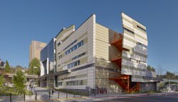
Exterior of West Los Angeles College, California

Color’s prominent role in wayfinding has become a focus in architecture.  Humans use color as a primary means of sorting and grouping objects: think about the uniforms of sports teams or the coloration of prescription medicine pills. Parking garages, for example, often code their floors by color, sometimes painting the uniquely colored floor number in a size three or four feet tall. Large, flat parking lots are often divided into sections that may be labeled by a number or a symbol—for example, zoos frequently use animals—but it is usually printed in a unique color. Color association is strong and memorable for regular occupants and occasional visitors alike. 

In hospitals, color décor or signage are employed to help visitors locate their destinations. Sometimes they pair signs with colored lines painted on the corridor floors or walls, turning the floor itself into a giant map. A study conducted by Cromwell Architects Engineers and the University of Minnesota, published in 2012, found that color helped 72% of respondents to find remote locations in a pediatric clinic. Colored walls or floors were slightly more effective than color signage, and 58% correctly remembered a corridor color. When they were given verbal instructions that included the color, 69% remembered the correct color corridor.

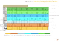
For the upcoming Golisano Children’s Hospital in Fort Myers, Fla., advisory groups of children and parents were interviewed by the designers, FKP Architects, to discover aspects of their community that were meaningful to them: beaches, fishing, surfing, local animals. These became the inspirations for both color and texture selections that were used to define different areas. The floors of the building are color-coded, employing hues that had psychological impacts matching with the program of the space. Public lobbies and emergency room spaces on the first and second floors feature high-intensity colors, yellow and orange. The next three floors—housing chemo/oncology patients, the neonatal ICU, and the pediatric ICU—are decorated in calming shades of blue. At the top, bed floors feature medium-intensity greens drawn from nature.

The color strategy by floor for Golisano Children's Hospital in Fort Myers, Fla. Courtesy FKP Architects.

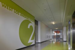
Educational facilities are adopting similar strategies. West Los Angeles College is a community college, so it is frequently occupied by new students who may not know their way around. The new classroom building provides occupants with a strong visual link between color and floor number, a startling impression the moment a visitor steps out of the elevator. Wall and floor color cueing make it easy to orient oneself, even during the rush between classes.

Color is proving to be a powerful tool for designers, having an impact on both aesthetics and functionality. Carefully applied color not only provides wayfinding assistance, but can also be fully integrated into the aesthetic vision of the facility.
Related Stories

Sponsored | Coatings | Aug 22, 2016

The impact of light on color

“Color is defined by two things: the chemistry of a pigment and the type of light that shines on it,” explains Mike Churchill, technical manager for extrusion coatings with Valspar

Sponsored | Coatings | Aug 18, 2016

Premier projects across the globe feature Valspar's Fluropon coatings

Valspar’s Fluropon coatings are popular due to their high durability, outstanding performance characteristics, and broad color palette.

Sponsored | Coatings | Aug 15, 2016

Can swift graffiti removal keep crime rates down?

To reduce the cost, time, and hassle of cleaning up graffiti, Valspar has a graffiti-resistant system protecting all coil and extrusion coatings

Sponsored | Coatings | Aug 11, 2016

The art and science of color planning for performance requirements

Inorganic pigments are typically used to meet high performance requirements but typically include fewer bright colors.

Sponsored | Coatings | Jun 28, 2016

Achieving greater building performance with color selections

With more than 20,000 colors to choose from, Valspar offers coatings that lower heating costs, lower cooling costs, and remain pristine in coastal settings.

Coatings | Jun 13, 2016

Sherwin-Williams color forecast identifies 40 hot colors for 2017

The four palettes—Noir, Holistic, Intrepid, and Unbounded—were developed by a team of design and color experts.

Sponsored | | May 25, 2016

Live Greener with Fluropon Pure

With more Building Teams considering hazard reduction and ingredient transparency in their material selection, many are excited about a new coating that fits that bill in a myriad of ways 

Sponsored | Coatings | May 24, 2016

Prepainted metals for interior design visions

With high-quality Valspar coatings, pre-painted metals can be abrasion resistant even for heavy commercial use, delivering protection and long-lasting beauty.

Sponsored | Coatings | May 2, 2016

At the Forefront of Design Freedom

From prismatic coatings with mica flakes to graffiti-resistant coatings to coatings with a crinkle finish, Valspar scientists help create the impossible.

boombox1 - default
boombox2 -
native1 -

More In Category


halfpage1 -

Most Popular Content

  1. 2021 Giants 400 Report
  2. Top 150 Architecture Firms for 2019
  3. 13 projects that represent the future of affordable housing
  4. Sagrada Familia completion date pushed back due to coronavirus
  5. Top 160 Architecture Firms 2021