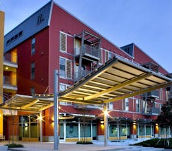
Color is a major element in project design. People make subconscious judgments about the built environment within seconds, largely based on color. For this reason, Valspar’s Fluropon is available in over 20,000 colors, including solar reflective ENERGY STAR–compliant formulations and special-effects colors.
Architects throughout the world trust Valspar to deliver durable coatings for monumental projects. We are known for our ability to create custom colors that help each project come to life. It is important to understand the science behind color for the highest-quality finished product.
“Color is defined by two things: the chemistry of a pigment and the type of light that shines on it,” explains Mike Churchill, technical manager for extrusion coatings with Valspar in Garland, Texas. “Using only one light source, a given color could be matched with multiple pigment combinations, but change the light source and these matches will look visually different from one another. That’s called a metameric match. For exterior applications we default toward a daylight, or D65, light source for the match. It simulates the spectrum of visible light at noon, which is a roughly even distribution at all visible wavelengths.”
When one is viewing color matches, it is important to keep in mind that the light source alters the appearance of a given color. For example, fluorescent lighting has more blue light that bounces off of objects, giving colors a cooler appearance. Incandescent lightbulbs show more in the red and green range, giving colors a brighter appearance. Keep in mind that Valspar color matches for exterior applications default toward a daylight light source, so color matches may not look the same as submitted chip in different types of lighting.
About the Author

Jeff Alexander
Jeff Alexander, Sherwin-Williams Coil Coatings VP of Sales for the Coil and Extrusion division has been with Sherwin-Williams (formerly Valspar) since 1997. He has an entrepreneur spirit and has thrived in building relationships with our customers. Jeff has fully immersed himself in all levels of the coating industry and enjoyed his term as National President at NCCA (National Coil Coating Association). He is focused on continuing to educate customers on the paint industry.
