Reimagining a 1980s midrise as a brand-forward headquarters

This blog post was authored by Kyle Benjiman Troutman, Writer and Editor, LPA.
For Murray Company, its employees are everything. And since 1913, the mechanical and plumbing contractor has taken pride in its history, its workforce, and its ability to serve clients. As for where it serves them—the company had outgrown its old space, which also lacked amenities and failed to represent its growing brand.
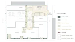
Looking to the future, Murray wanted a modern headquarters that honored its heritage and celebrated the people who make the work possible. The company turned to LPA’s integrated team to transform a five-story medical office tower built in 1986 in Cypress, Calif., into a singular headquarters worthy of their brand.
LPA provided architecture, interiors, lighting, landscape and structural engineering expertise, alongside Murray’s mechanical and plumbing work, to help make the space distinctly its own.
“We designed this project around respect for Murray’s brand and people,” says LPA Design Director Rick D’Amato. “Every decision was meant to build pride in the staff and in the company.”
The project is a study in reuse, centered on strategic material decisions, improved building performance, and sustainability.
Less-is-More Adaptive Reuse Design
Choosing to renovate instead of building new cut costs and reduced environmental impact by lowering construction waste and carbon emissions. The design team preserved as much of the existing building as possible, selectively refreshing elements to meet Murray’s functional needs.
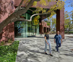
The tower’s exterior stone elements, windows, and pink granite remained intact, nodding to the structure’s history. By keeping and repurposing the perimeter offices and metal storefront systems, the team reduced material use and minimized additional construction.
The project at large follows a less‑is‑more approach. A deliberately limited material palette reduced the amount of product that needed to be manufactured and shipped, while elevated detailing celebrated the materials that remained.
Instead of high‑end hardwoods, the team used plywood to create durable surfaces with a lower environmental footprint. Local manufacturers supplied decorative luminaires and many fixtures, shortening supply chains and supporting regional industry. Murray’s in‑house mechanical and plumbing work also replaced outdated systems and improved operational efficiency.
Integrated Design Celebrating a Storied Brand
Murray’s people define its brand.
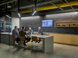
“Our goal was to design an environment where employees feel recognized for who they are and what they bring,” D’Amato says. Social and communal areas were prioritized to support employee recruitment and retention and stronger client relationships. The team concentrated its efforts on crafting common spaces that function as flexible work zones, informal meeting areas, and places to socialize—areas that were missing from the company’s previous office.
Amenities throughout the rest of the tower cater to employees’ wellness and professional needs. The ground floor houses a fitness center, golf simulator, darts and ping‑pong areas, conference spaces, break rooms, and lounges for gatherings and informal meetings.
On the office floors, coffee bars near the elevators create small vignettes for breaks and spontaneous collaboration. Stairwells that lead to the upper floors are branded to make them more inviting, so staff are more likely to use the stairs and benefit from extra movement. “The new space found its rhythm almost immediately,” D’Amato says. “The building became a place to connect and thrive, rather than a place to simply clock in.”
Exposed ceilings on some floors, meanwhile, reveal the plumbing and mechanical systems as an intentional reference to Murray’s trade. The fourth floor showcases exposed systems for a first-hand view of project infrastructure, creating a deliberate contrast with the dropped acoustical ceilings elsewhere. Murray contractors also had a heavy hand in the design of the restrooms, another place where they stamped their expertise.
“There’s a vibrancy to Murray’s work, so the building’s design had to hold that same energy,” D’Amato says.
Making Plumbing Heritage Pop
The project’s material palette reflects the client’s brand: refined, simple, and industrial. Finishes were selected for durability and to make the space feel calm and intentional.
Raw metals, wood, and concrete give the new headquarters a rugged elegance, while copper accents—including exposed piping and surfaces—celebrate Murray’s plumbing heritage. In social spaces throughout the building, rows of plumbing pipe in varied natural finishes are mounted side by side. These function as art and an aesthetic reminder of the company’s craft.
“The decision to treat these elements as art was contagious,” D’Amato says. “Once leadership embraced that idea, the team started to see their own work differently: with pride and a renewed sense of ownership.”
Murray’s signature yellow also appears throughout to accentuate walls, while a mostly neutral palette keeps the interiors flexible for future growth. In community areas, the palette becomes more tactile with copper tile at coffee bars, live‑edge wood countertops, and conference tables handmade by employees using live‑edge wood and resin. The resulting design feels familiar to tradespeople—a place where employees can be comfortable, proud, and unafraid to work hands-on.
“We wanted the design to literally express what they do,” D’Amato says. “Every pipe, every bracket, every welded seam is part of their story.”
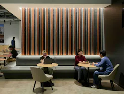
Strategic Lighting Design for a New Office Interior
The new entrance portal’s double‑height lobby is the project’s first signature design element. Layered theater-inspired lighting reveals the space’s architecture and anchors the reception area’s darker palette.
The lighting design team used a mix of ambient, accent, and task sources to highlight brand moments without overwhelming the eye. Strategic spotlights and low‑glow fixtures showcase the lobby’s signature element, the Murray truck—a vintage Chevy 3600 pickup that was restored to its original glory, resembling the company’s original work truck.
Strategic lighting casts glows on the truck and a handcrafted art piece representing the American flag, which sits in the truck’s bed.
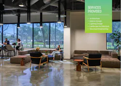
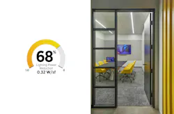
Lighting levels were calibrated to work within wattage limits, so every floor reads as a cohesive whole: Bright enough for circulation and work, and subtle enough to preserve texture and materiality. In office areas, layered lighting balances daylight with task lighting for open and private workspaces. Coffee bars and informal collaboration nooks are lit with lower fixtures in varied orientations to encourage relaxed, off‑the‑cuff interaction.
A well‑lit Wall of Fame and thoughtfully placed luminaires, meanwhile, turn functional elements into moments of brand storytelling that feel unmistakably Murray.
“This project is, above all, an act of giving back,” D’Amato says. “Every design decision was measured against one question: Does this honor the people who built Murray Company? If the answer was no, we didn’t do it.”
About the Author
LPA
LPA believes that sustainability inspires great design—design that’s environmentally intelligent and efficient—yet also visionary, vibrant and life-changing. From K-12 and higher education facilities to civic, recreational, corporate and healthcare developments, LPA delivers design solutions that benefit the environment, improve the bottom line and enrich the human experience. Visit LPA's Insights page for more blog posts. Follow us on Facebook, Instagram, LinkedIn, Twitter, and YouTube.