Coloring in the Lines
Color as an important aspect of artistry and psychology has been well documented through the years, but the science of getting just the right hue can still be a tricky art. Attempts to understand color go back centuries, wrote David Euscher, IIDA, LEED AP, RID, in a blog post for A/E firm Page, where he is associate principal and senior designer. Long before Pantone and its proprietary color matching system, there was a 700-page tome, handmade in 1692, that described every color available to artists back then.
“What I find interesting about this book is it shows that, as observers of color in our environment, we have been trying to understand it so that we can capture the way colors affect us,” said Euscher in his blog post. “[We want to] repeat it, imitate it, and recreate the sensation or effect that was brought about by those colors.”
Created by a Dutch artist identified only as A. Boogert, the color guide describes how to create different colors using pigments and varying amounts of water. The art of mixing watercolors to create the “right” one continues in the methods available today to achieve a particular shade, said Euscher. “This book illustrates one author’s attempt to scientifically describe how to achieve specific colors so that producing [them] in artworks can be made more easily and reliably,” he wrote. Achieving the desired effect can go a long way in reinforcing corporate logos and schemes, or establishing moods and styles in different rooms, floors, or even separate facilities.
Today, artists and designers have at their disposal a variety of color reproduction systems, including Pantone, to achieve the desired effect clients are seeking. Selecting the ideal coating technology or paint system can mean the difference between a long-lasting façade color or an exterior that fades too easily soon after application.
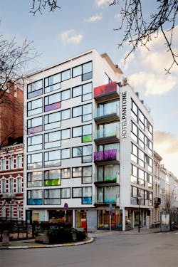
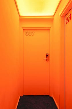
Pantone itself has recently expanded beyond fashion—and into hospitality. In 2010, the company opened the Pantone Hotel in Brussels, Belgium. The hotel features minimalist color palettes inspired by Pantone’s own swatches. Designed by architect Olivier Hannaert and interior designer Michel Penneman, the colorful boutique hotel also spotlights Pantone-hued photos, bedding, and other small details found in a hotel room, transforming the hospitality experience into a truly “colorful” one for guests.