
Drawing influence from fashion, science, nature, pop culture and global traditions, Sherwin-Williams introduces colormix™ 2014, which captures colors that inspire creativity and design in today’s world. The four-palette collection provides design professionals with a guide to help them define the moods they want to create and select colors for their projects.
“The state of color is constantly changing and gathers influence from the world around us,” said Jackie Jordan, director of color marketing, Sherwin-Williams. “From our global race to acquire knowledge in science and math to feminine-charged colors and fabrics of the runway, the colormix 2014 palettes are a colorful representation of these influences and the moods they create.”
Jordan, along with Sherwin-Williams color experts, researched and selected 38 key colors for the 2014 forecast, which are grouped into four palettes: Reasoned, Diaphanous, Curiosity and Intrinsic.
REASONED
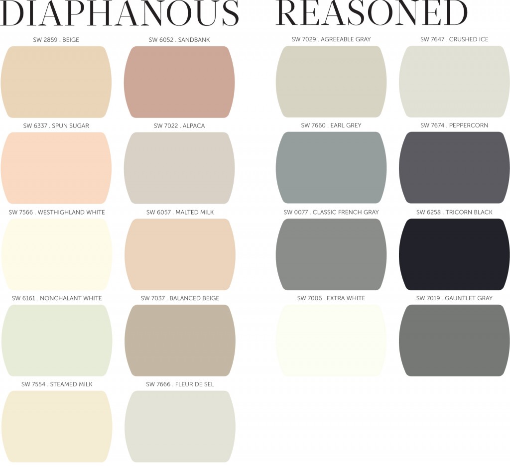
Founded in black, white and gray, this palette celebrates the quantifiable world’s impact on design, illustrated by the use of geometry and 3D printing to create patterns and shapes in all categories of design. The hues of Reasoned, which include Tricorn Black, Agreeable Gray and Crushed Ice, represent shadows, negative space and tone-on-tone layering.
“Mathematics play a significant role in our world today and helped to define this palette,” said Jordan. “We are in a global race to acquire knowledge, especially in the field of math, and we are consistently aware of the impact of percentages and numbers in our current economy. Gray is the new black, and math is the new sexy.”
DIAPHANOUS
The delicate nature of this palette embodies the very essence of balance, simplicity and elegance. The colors of Diaphanous are light, delicate and translucent. Society’s need for overconsumption has given way to minimalism and a quiet reality. This palette evokes tranquility, sensuality, serenity and escape.
“Silk, chiffon, feathers, natural wool, rose gold, barely-there patterns and soft florals are key to this palette,” said Jordan. “It is about a balance of simplicity, delicate colors and strength tempered by softness. We are experiencing this blurred duality all around us, from menswear influences on feminine clothes to the soft-touch material on electronics.”
CURIOSITY
It has been said that what one may see as strange and unique, another may see as beautiful — this is the wonder of the Curiosity palette, which is largely driven by science and geology. Nature at the most molecular level is becoming a resource for patterns, textures and colors, such as Show Stopper and Quixotic Plum. Mined minerals, metals and raw gems also fuel the color story, which includes Library Pewter and Relic Bronze.
“In today’s world, oddities are now objects of fascination and the bizarre has never been more beautiful, especially in the design world where designers are using the ordinary to create the extraordinary,” said Jordan. “The Curiosity palette can be described as mad science meets fantasy; it’s avant-garde, experiential, dark and exotic.”
INTRINSIC
A little bohemian and plenty of color make up the Intrinsic palette. Its focus is around embracing and preserving tradition, culture and design, while bringing in new influences. World events in 2014, such as the Winter Olympic Games in Russia, are driving a new appreciation of folkloric costumes, patterns and styles of the country.
“We see people embracing family and their heritage now more than ever. This palette is a celebration of both cultural and individual traditions — old and new,” said Jordan. “It is also about a new appreciation for handmade crafts, such as lace, embroidery, batik and other ethnic dyeing methods.”
COLOR RESOURCES
There are several ways for professionals to interact and find inspiration with color selection tools from Sherwin-Williams. At swcolor.com, design professionals can access downloadable palettes for use in color rendering software and order large-sized color swatches and fan decks. Sherwin-Williams also has an online Color Visualizer that allows designers and clients to upload interior or exterior images to explore and experiment with the more than 1,500 colors.
Sherwin-Williams STIR® magazine annual print edition, eExtra e-newsletters, plus exclusive content on the STIR tablet app also provide inspiration, news and resources for design professionals. Visit swstir.com, as well as the Sherwin-Williams Facebook® page for design professionals.
Design professionals will also find a world of color at their fingertips with the new Sherwin-Williams ColorSnap Studio™ iPad® app. ColorSnap Studio blends the best of Sherwin-Williams color inspiration tools — the ColorSnap® smartphone app, the powerful online Color Visualizer, plus the Explore Color functionality — into one iPad app offering all the ease-of-use of a tablet including high definition, as well as pinch, zoom and swipe features.
ColorSnap Studio users can access the same functionalities as the ColorSnap smartphone app, which makes it easy to find the closest-matching paint colors to those captured within an image and to fine tune colors using the lightness, saturation and hue features. And now, they can also use the Color Visualizer tool, which was previously only available for desktop use, to experiment with thousands of color combinations. Applying color and trying different colors is easier than ever with no edge-masking required. Touch the color and simply use a finger to “finger-paint” it onto the image. It is a quick and easy way to show clients different options using the iPad app.
With the click of a button, any online image can turn into a palette of paint colors, with Chip It!, an interactive tool from Sherwin-Williams. This Web-based tool allows designers to select any online image and instantly identify the Sherwin-Williams paint colors that correspond to the colors contained within the picture. Designers, as well as their clients, can now use the colors that inspire them while surfing the Internet and turn them into paint palettes for any project.
In addition to interactive tools and inspiration, Sherwin-Williams offers offline help with COLOR To Go® paint samples and the Sher-Color™ Advanced Color Technology system for fast, accurate color matching.


